The other day I was doing a listing presentation for a new client; she’s got an adorable 1 bedroom condo unit in Magnolia with an outstanding unobstructed view toward Phinney and the Cascade Mountain Range. That alone will get a few people to like the unit, the layout being another as well as some really nice upgrades she’s done to the flooring, the bathroom and kitchen over the past several years. But, what we’ve got to consider prior to going on market is if the color scheme in her home will translate to more or less dollars when she sells.
There are many colors that are what I like to describe as “very personal” and some of those are in this condo. What is on my list of “very personal” colors?
purple, pink, some shades of green, peach, bright yellows, some blues, reds, and orange.
![]()

In this unit we have hot pink, orange, teal, and a darker red-orange all dressed up with Morrocan and Asian-influenced style furnishings. Overall, the effect reminds me of high end Thai restaurants I’ve been in before so, personally, with the bamboo floors and other kitchen and lighting upgrades I like it. However, when selling real estate we have to think about what will be appealing to a wide variety of buyer tastes. Obviously, you can’t meet everyone’s personal style but we can be aware of what most buyers are looking for. The best thing here though is that it is “only paint” and not the fixtures or cabinets or other elements of the property that are the problem.
Sometimes you’ll go into a home and see very personal color choices in things such as tile. While green and blue glass tile is popular right now I am also waiting for the time 20 years from now when that will be looked upon the same way blue and pink bathtubs are now. These were all the rage back in the 1960’s and 1970’s but younger buyers today can’t stand them and see them as outdated, much like orange shag carpet or macrame curtains – oh yea, all of these are in the house I just bought in October of 2007. I’ll have to post some photos.
Anyhow, for this Magnolia condo client I think we’ll very likely stick with her color scheme because I think it works and it will show well in online photos. There’s nothing more boring than plain white or cream walls.
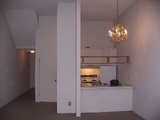
Yet another condo we’re helping a client get prepped for sale in Mercer Island is getting a new color scheme put in after being a stale white for many, many years. The colors that were chosen are kind of a creamy, butter type of color (not yellow) and a shade of plum. Normally I’d never go with plum (see list of personal colors above) but in this case it fits. The berber carpet color has a purplish tint to it which is hard to match anyway but rather than try and downplay it we’ll be enhancing it with the plum walls. The majority of the unit will be the cream color but 2 accent walls are being put in to highlight the architectural elements of this condo that were not enhanced by an all white scheme. With somewhere around 14′ ceilings it’s worth it to show off the clerestory windows above the sliding glass door/window to the deck and to help create more of the outdoors coming in – plus providing a better depth perception between unit buildings and the outside landscaping. A gorgeous blooming magnolia tree just off the deck was also part of the inspiration for the color scheme.
The cabinets in the kitchen and bath will also be freshened up with a glossy white paint to help them stand out against the tall plum wall in the kitchen and to make them much easier to clean for the next owner. A previous owner had painted them with a flat paint – a big no-no when painting in kitchens and baths because they show dirt/grease easily and they don’t clean up as well.
I’ll provide updates as we move along with this client’s prep work and show how it turns out when we list in roughly a week. For now, here are a couple of “before” photos for the MI condo.


